Cannes Event Campaign
Skills: Poster Design, Branding, Image Manipulation
Client: Personal Project
Role: Graphic Designer
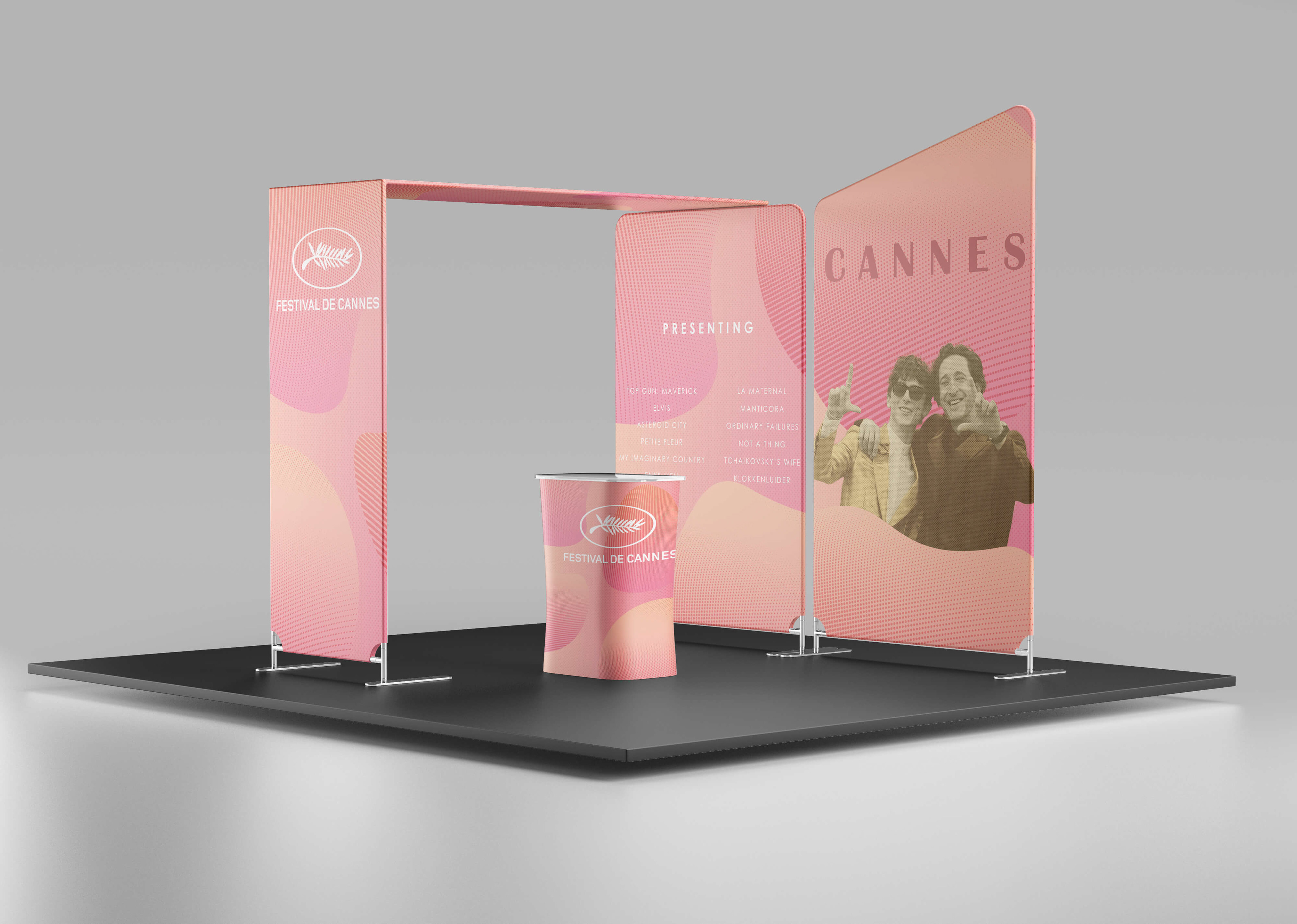
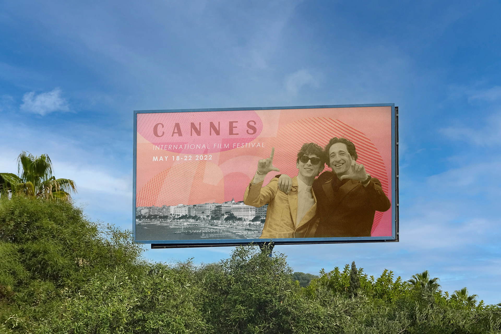
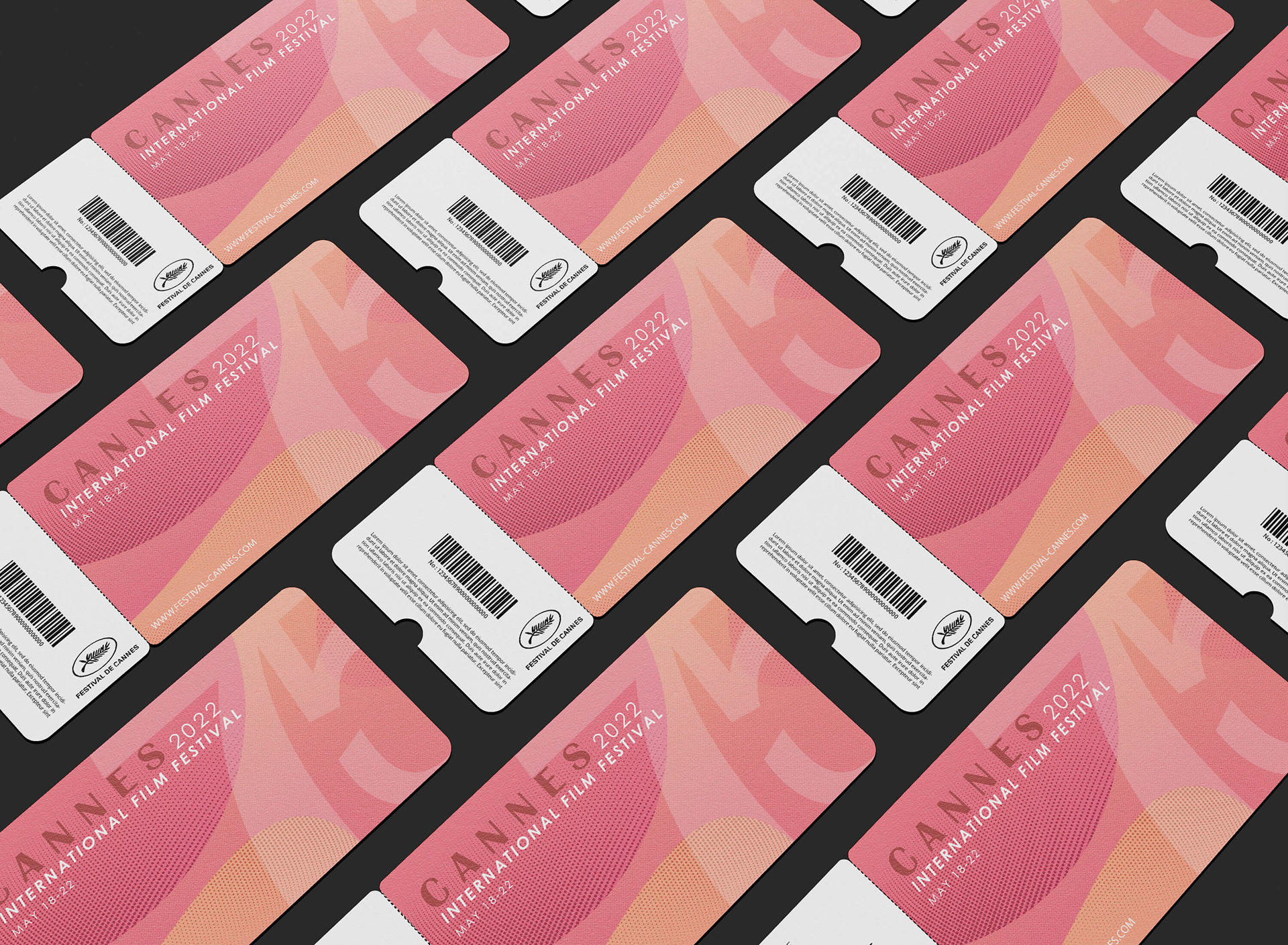
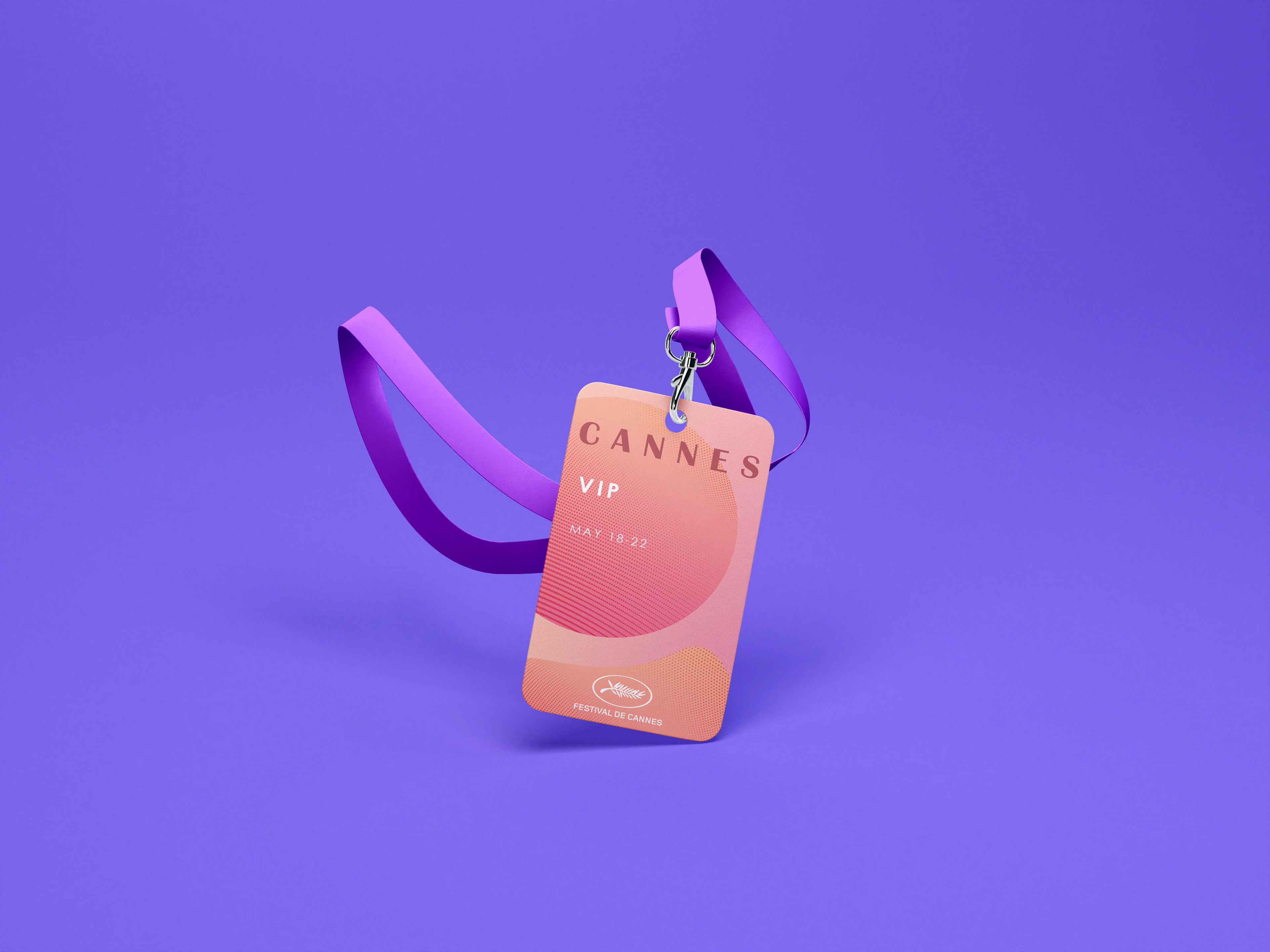
For this project, I was tasked with completing an advertisement campaign for an event of my choice. As a film enthusiast, I chose the Cannes Film Festival. The deliverables were three posters, ticket and VIP pass designs, along with several additional mockups.
Early Drafts
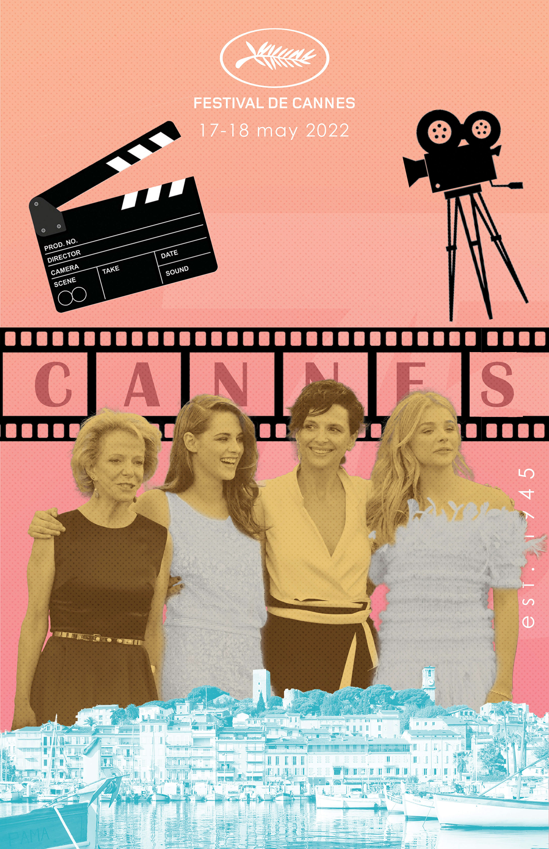
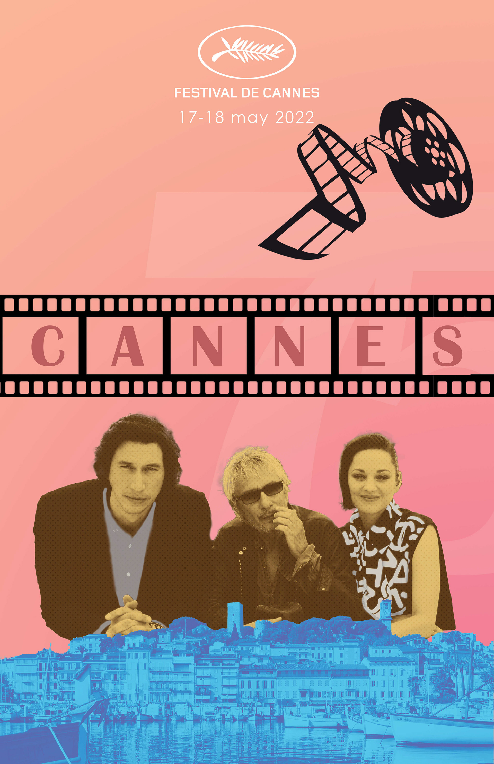
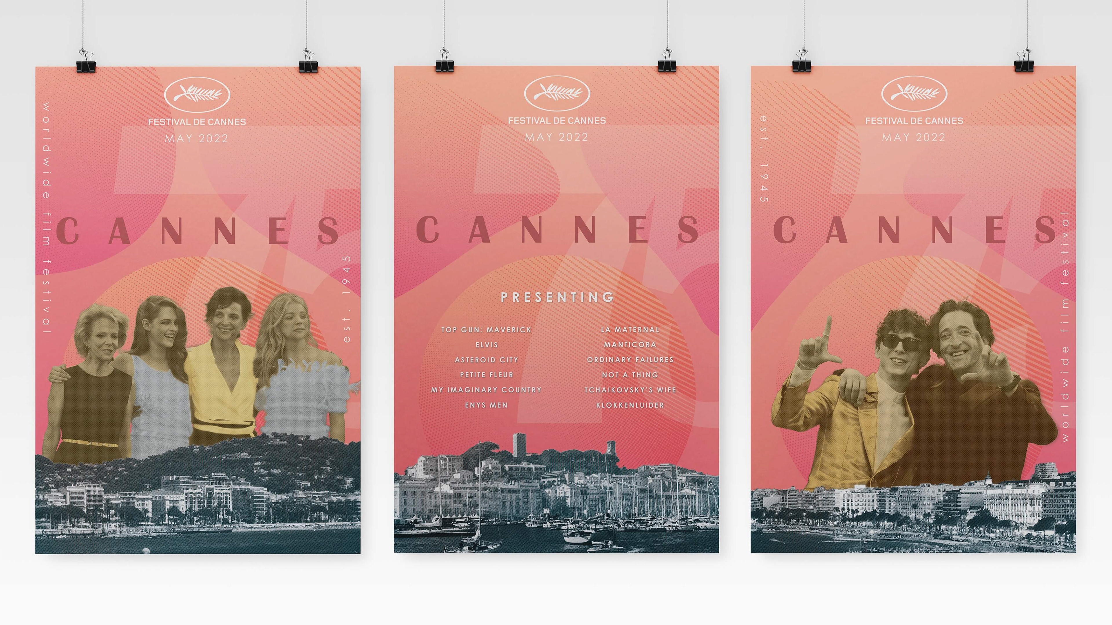
Through research, I found that the brand primarily utilizes sunset colors and gradients in its branding and advertisements, so I decided to incorporate those colors into my background. I decided to use photos of actors from previous Cannes Film Festivals and the shoreline of Cannes, France, with color and texture styling to integrate them into the poster.
Initially, I struggled a lot choosing the right colors. My first attempt at the actors was meant to be an "Oscar gold" but ended up looking more "Simpsons Yellow." And for the shore, I just threw different colors at the wall to try and see what would stick (definitely the wrong approach).
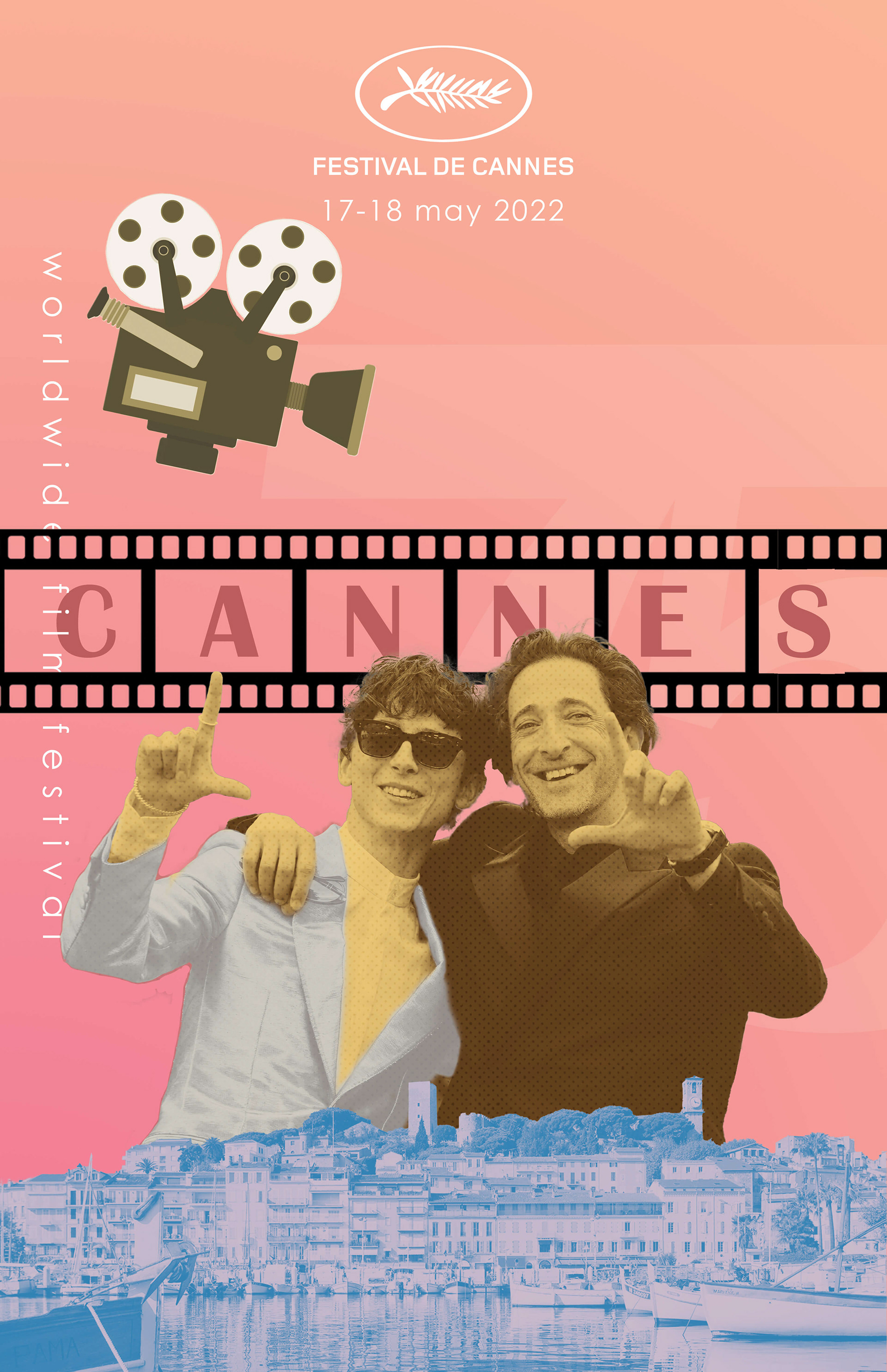
I also knew the background needed some additional elements to fill the empty space, so I initially used some film-related clipart and a reel of film running across the Cannes type.
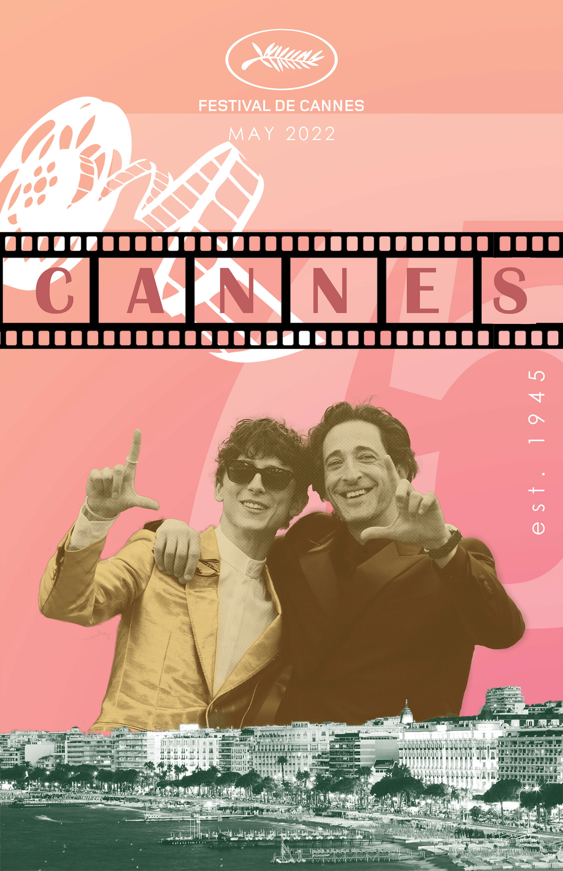
I went back to the coloring board and chose a yellowish faded-film look for the actors, masking out areas that I wanted to be different colors. I also swapped out the shoreline images for ones I found more interesting, and lined up the shore across all the posters for some visual symmetry, although I still wasn't satisfied with the color.
I altered the clipart in the background, but it still looked too messy and unprofessional, so I knew I needed to take a different approach.
Final
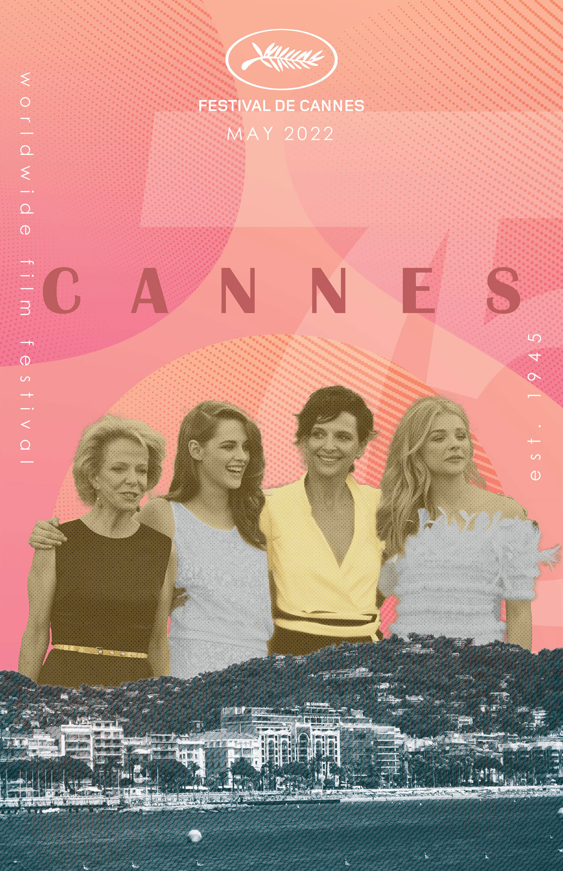
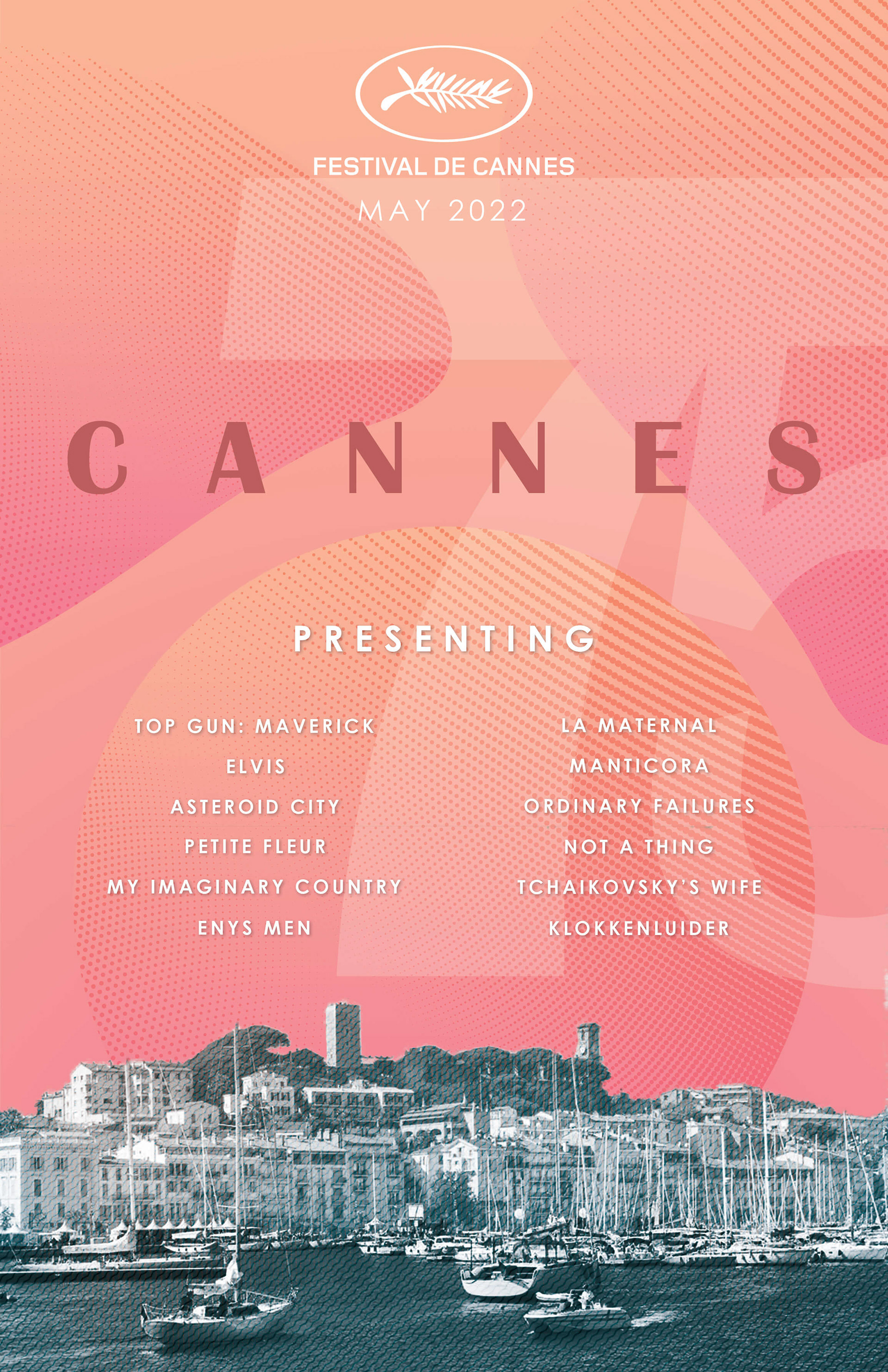
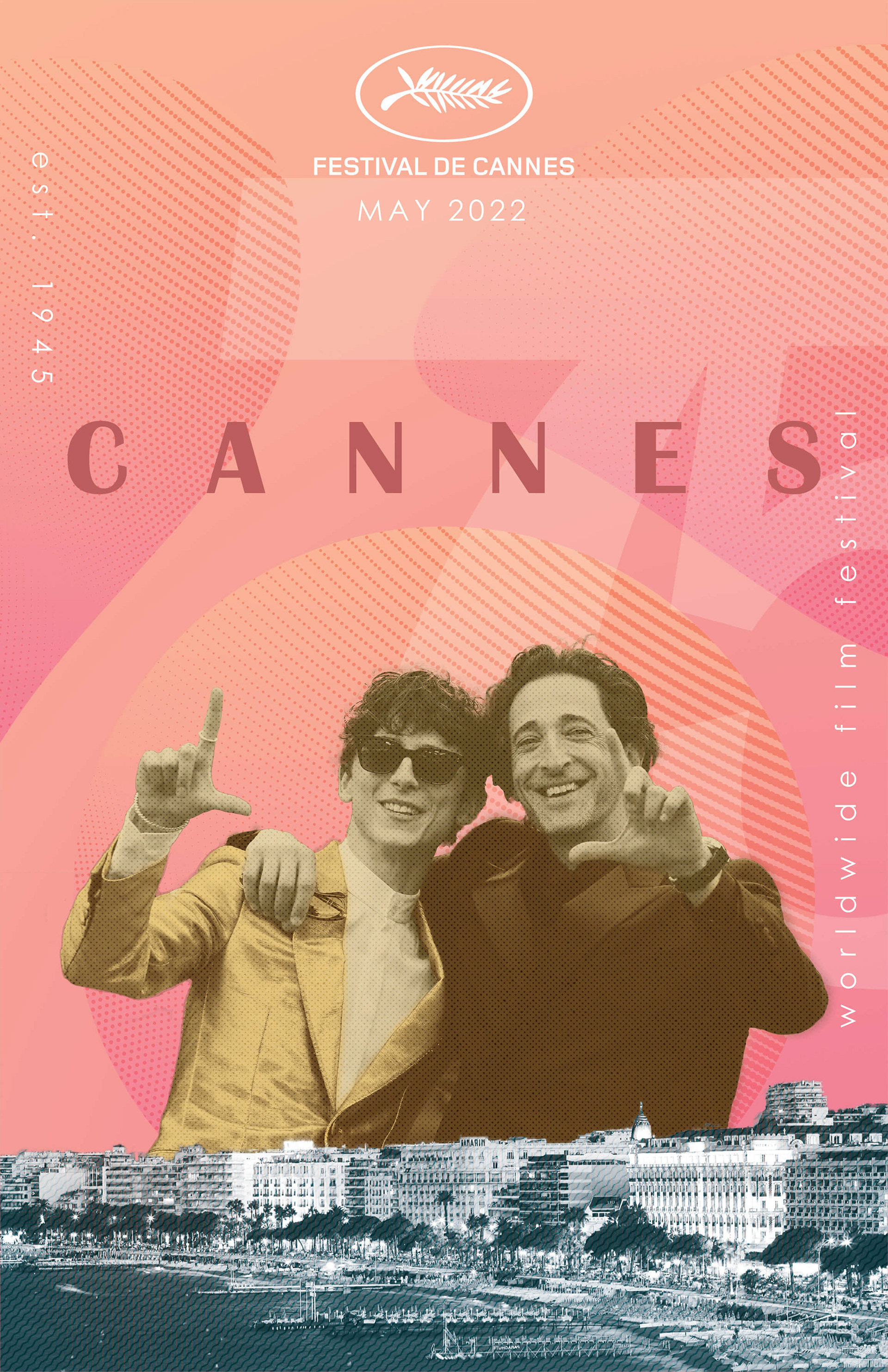
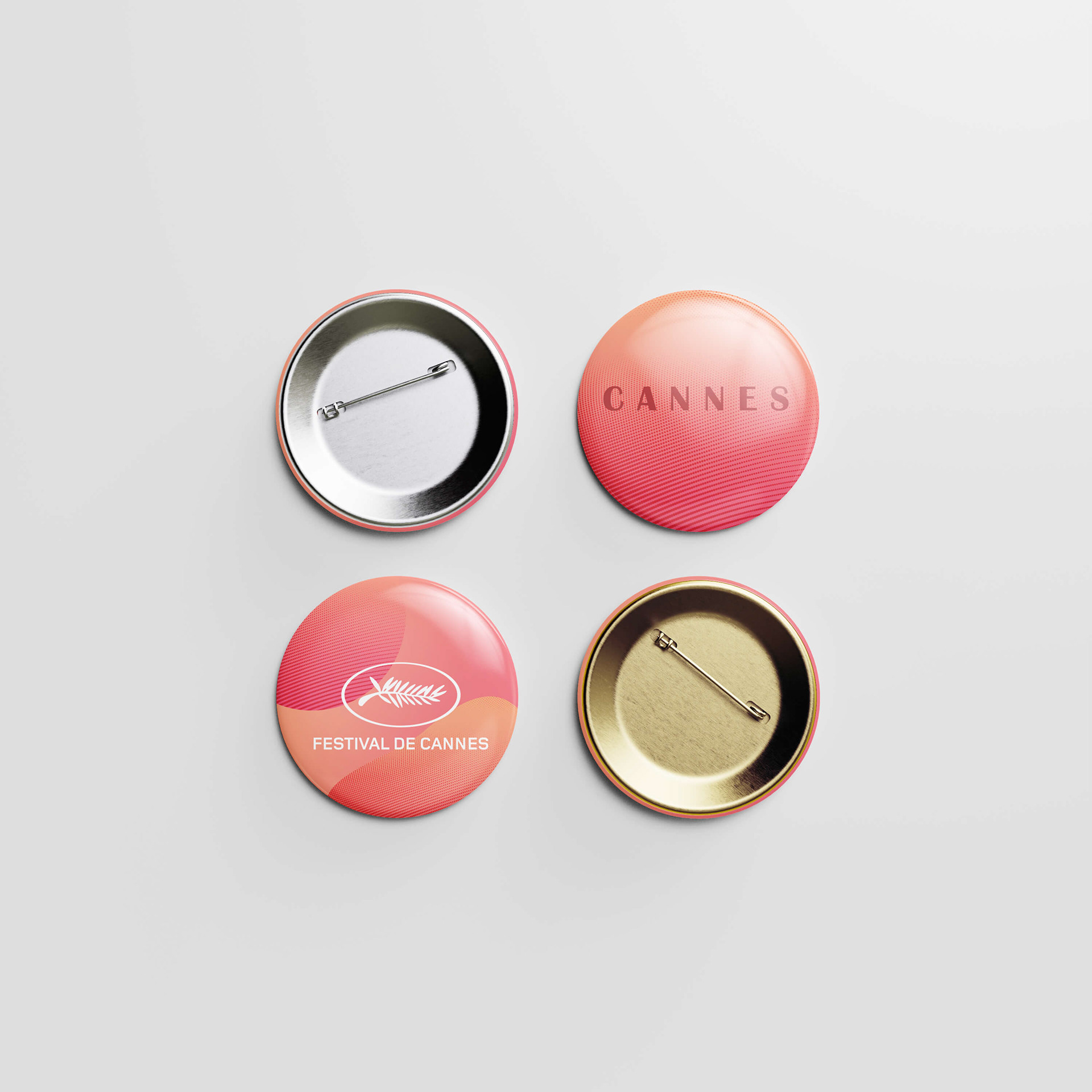
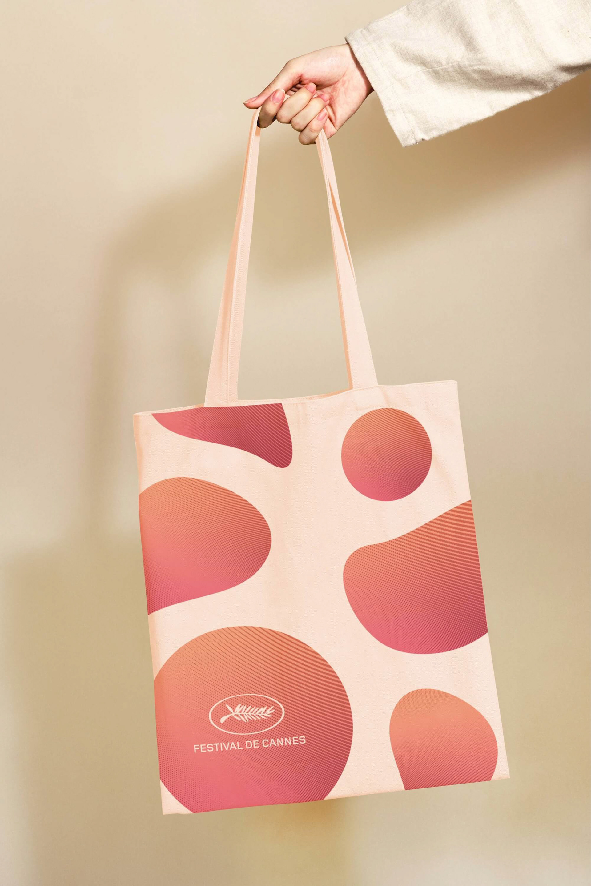
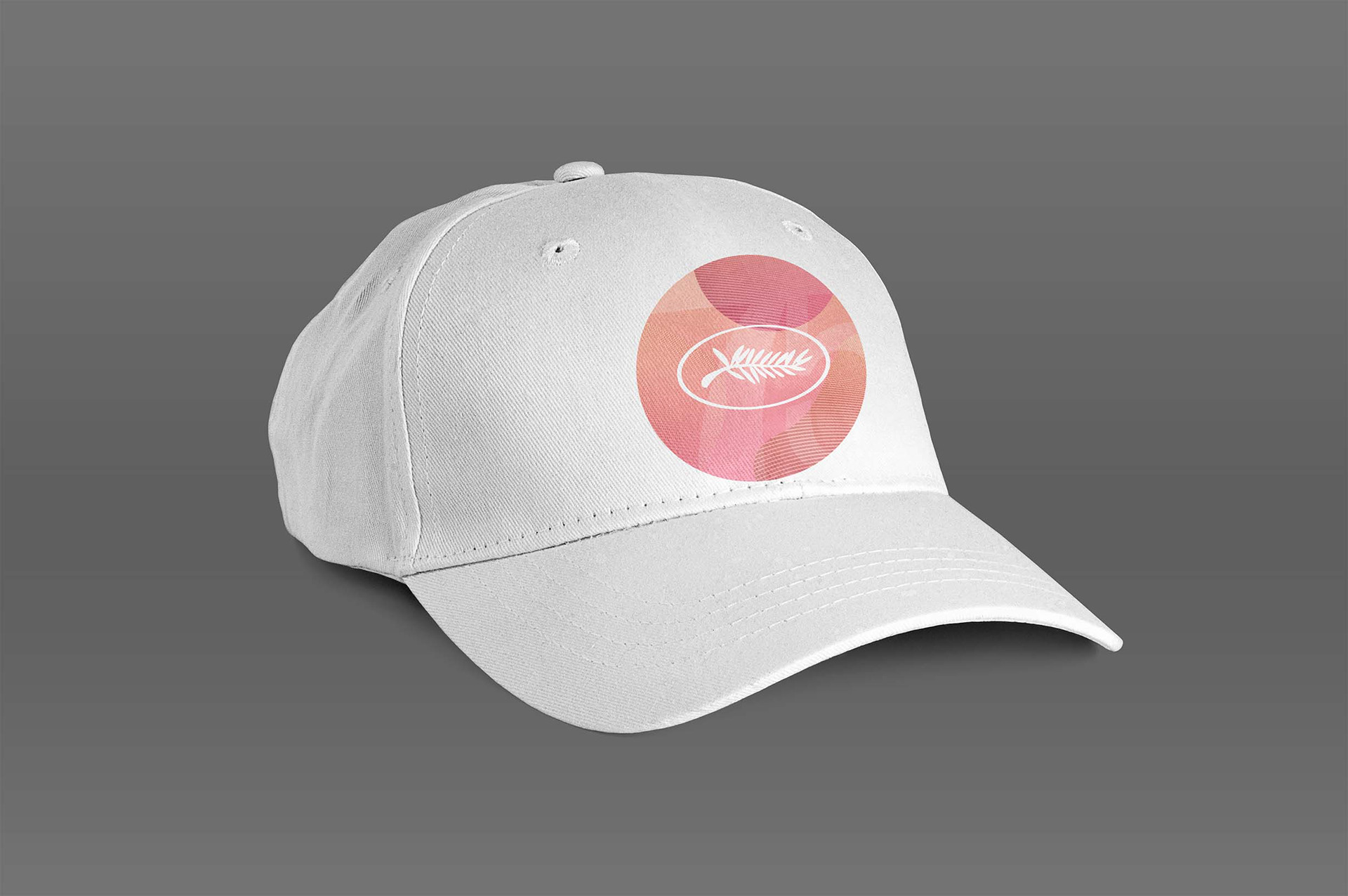
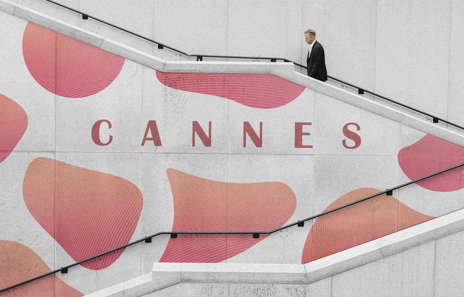
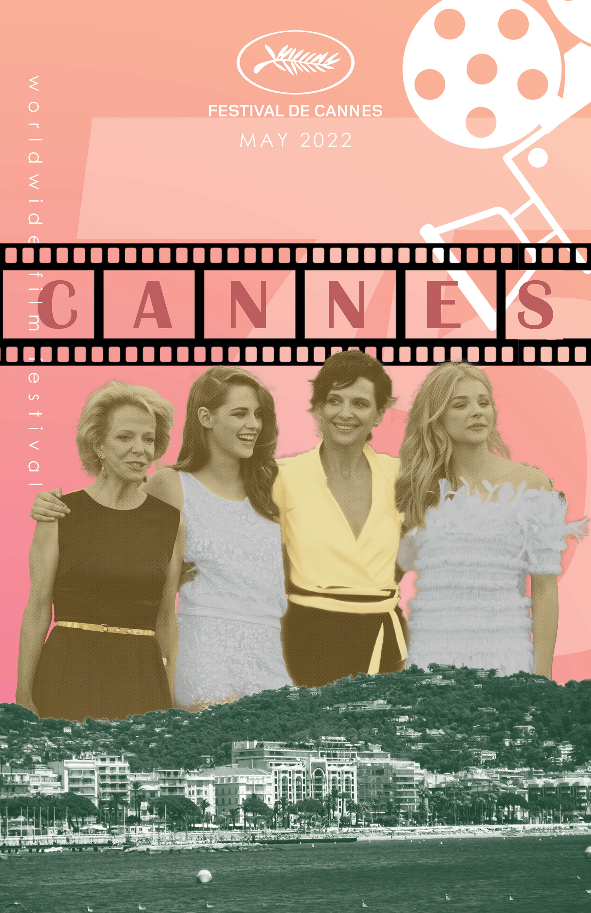
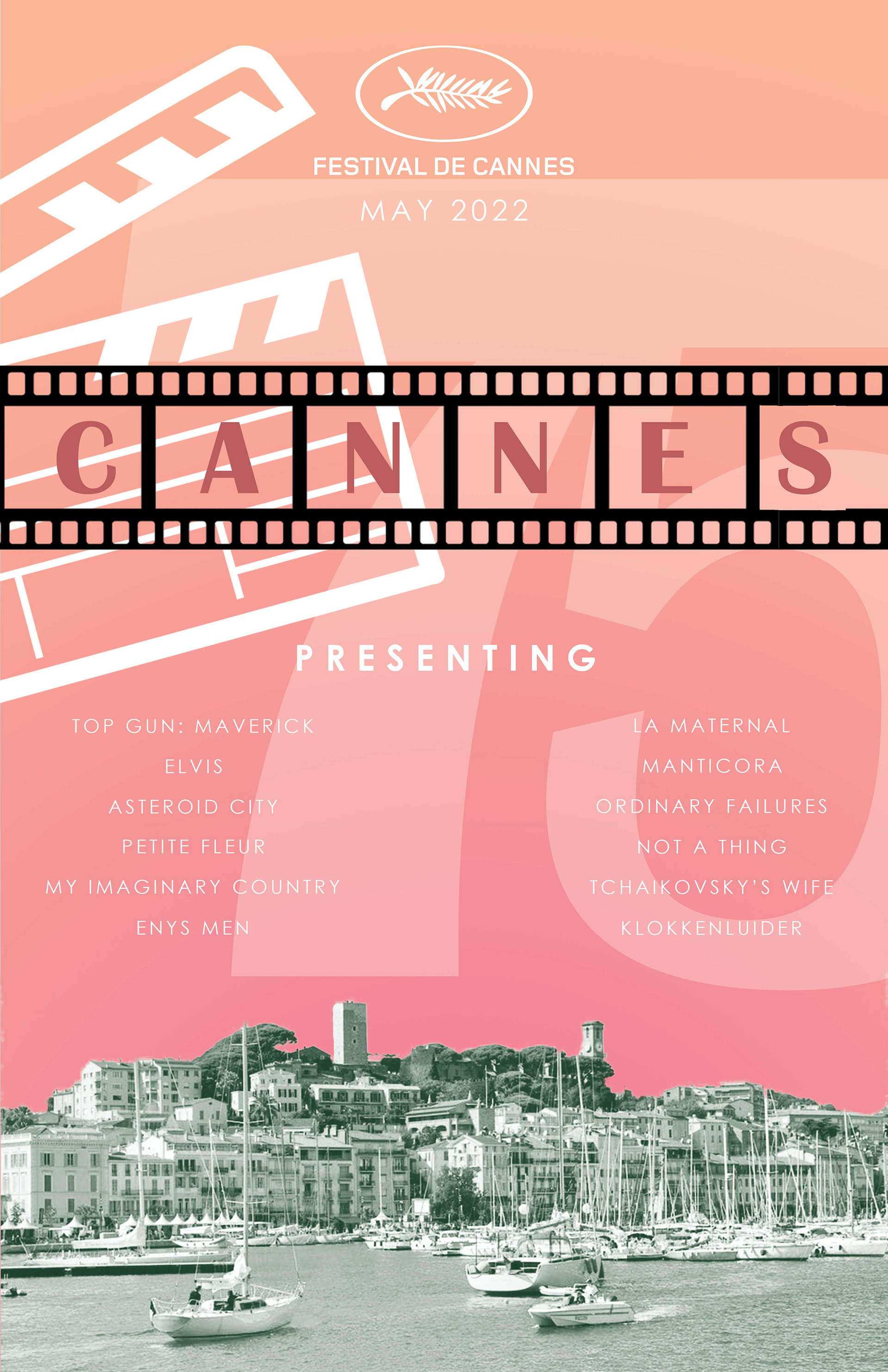
For the background, I returned to my original inspiration, which was the sunset. I figured, what's a sun without a sunset? So I began by creating a circle behind the main subjects and used the same colors from the background. I also added a halftone texture with some open spots to give the circles a more 3D look. I then experimented with adding more shapes around the circles until I achieved these lava lamp-esque shapes.
For the shoreline, I chose blue for the primary color because it matched the water, which was the main subject of those images. I also added a wave texture to better tie it in with the other images and the background.